%202.png)
%20(1).png)
SPEC CASE STUDY
'N' Crowd - Social recs for Netflix
Concept feature letting friends swap Netflix picks, cutting ‘what should I watch?’ fatigue.

Role:

Duration:

Tools:
.png)
Problem
Netflix’s main priority is engagement. An endless catalog leaves viewers unsure what to watch next despite a recommendations algorithm.
Goal
These were the guiding objectives before any user research.
- Add an in-app way for subscribers to recommend titles to friends, without changing core playback.
- Help users decide what to watch faster by surfacing human recommendations inside Netflix.
- Ship a clickable prototype in four weeks to validate the idea with no back-end work.
Research insights
Before sketching screens I needed to know two things:
- How people really pick something to watch (sources, pain-points, deal-breakers).
- What “social” could add without feeling intrusive or complicated.
Methodology
- Five semi-structured interviews with frequent Netflix users (24-35, mix of heavy-series bingers and casual movie-watchers).
- Rapid competitive teardown of three social-watch products: Teleparty and Sling (sync watch-party), Spotify (share playlists and view people's listening habits), and Tronko (share movie recommendations with friends).
- Affinity-mapping of interview quotes.
Insights
- Friends are the #1 trusted source.
Users rely on specific friends far more than reviewers—or Netflix’s algorithm.
Trusted sources for Film and TV recommendations
100%*
83%
0%
👀
*83% of these said this was a main source of recommendations
- No one uses the "rate titles" feature.
Two feared skewing the algorithm, three never noticed it—so star ratings can’t drive discovery. - Privacy is non-negotiable.
Every participant said: “Don’t show what I watch unless I choose to share.” - Existing tools miss the mark.
Watch-parties require schedule sync; public feeds overshare. Nothing offers a private, asynchronous “send recommendation” flow.
design
My goal was a friction-free, privacy-respecting way to share titles - something existing watch-party and activity-feed tools miss. The flows had to:
- Require no new accounts.
- Keep users inside Netflix.
- Never broadcast viewing history automatically.
I called the concept N Crowd - a name that reinforced privacy and discernment.
key flows
Invite someone
.png)
From the N crowd main page click the white "Invite Someone" button. Then...
Invite someone
%20(1).png)
... enter their email address and click "Send invitation". No sign-up, no schedule sync.
Respond to invitation
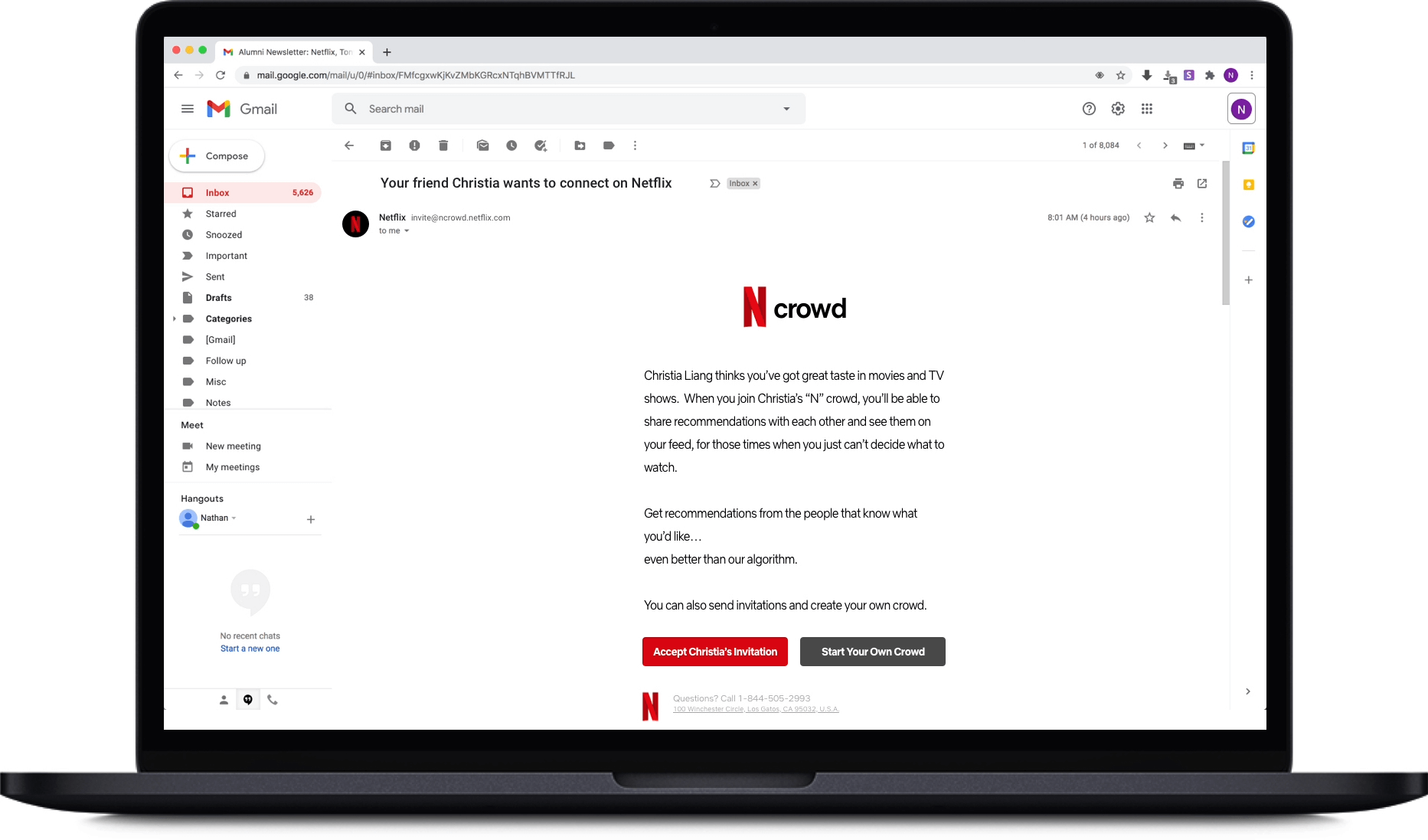
When a user receives an invitation email, they accept by clicking the red button. Then...
Respond to invitation

... arrive at their new N crowd page. Or...
Respond to invitation
If they don't want to accept, they can click the grey "Start Your Own Crowd" button.
Browse recommendations

A new row on the homepage allows easy access to the most recent recommendations
Browse recommendations
.webp)
While more granular controls are found in the "N" Crowd hub.
Make a recommendation

Choose a show and select who you want to recommend it to. Done.
Design tradeoffs
- Explicit “Send Rec” vs Automatic Feed Sharing
Chose an intentional Send button; nothing posts unless the user acts, meeting the privacy line all five interviewees drew. - Home-page “N" Crowd Row vs Separate Page Only
Added a single friends row to Netflix Home for zero-click discovery, yet kept a full "N" Crowd hub so users can browse recs by connection. The hybrid keeps visibility high without overhauling the entire home layout.
Testing
Now that the screens were done, I turned them into an interactive prototype using Proto.io. Six users completed four core tasks without guidance.
Findings & fixes:
- Users wanted to invite multiple friends at once → allow comma-separated emails in the field.
- alf weren’t sure a rec was meant for them, specifically → added “for you” label to headings.
- One tester feared mis-sending to all friends → distinct “Recommend to All” button + undo option.
Bonus:* “Delete Connection” button demoted to text link to avoid accidental drama.

Improved recommendation UI
Lessons
- A smart algorithm still needs human context.
Whenever the “cost of a bad pick” feels high, users lean on people they trust, even if the platform’s recommender is world-class. - Prototype small, test early, refine fast.
Even lightweight studies (5–6 users) can uncover blind spots—like unclear audience labeling or risky bulk-send defaults—long before code is written.
Next step: Curated picks
A future release could surface collections from trusted critics and filmmakers—turning Netflix into a discovery hub, not just a catalogue.
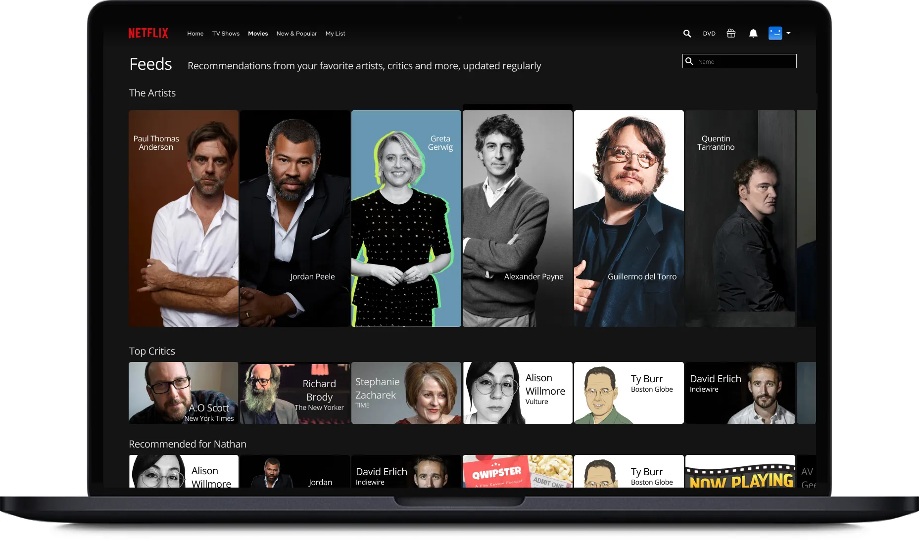
An assortment of lists curated by trusted sources.

Artist pages where they recommend the titles that affected and inspired them.