MINI CASE STUDY
Three-month sprint earns shopper trust and puts air purifier benefits first.


%20(1).png)


⚡ Role – UX/UI Designer
ISA’s site scattered a wide assortment of paid and free offerings across disconnected paths, leaving users disoriented and staff answering “Where do I go?” support tickets. Working with the lead designer, founder and engineers, I tailored onboarding by user type, unified navigation, surfaced key resources in a writer dashboard and folded every purchase into one streamlined checkout.
Onboarding friction removed · Support tickets dropped · Cart abandonment fell


ISA wasn’t a single product. It was a dense collection of overlapping offerings, surfaced inconsistently across pages. Users often couldn’t tell which features applied to them, what was free or paid, or how to take the next step. The challenge was to bring structure to that sprawl—clarifying entry points, guiding navigation, and helping writers feel grounded in their experience.
At the same time, we were designing without a formal roadmap. Feature priorities came directly from the founder, and there was no product manager to filter or sequence the work. The dev team handled requests as they came in, which meant we had to prioritize clarity, modular design, and careful documentation to ensure successful handoff—even as timelines shifted.
While working under a lead designer, I owned key flows and coordinated directly with dev to translate design decisions into implementation.
While I worked on nearly every part of the site, we focused the redesign on three core experience areas that spanned the writer journey - sign up, navigation, and checkout.
I collaborated with our lead designer to scope each phase around the most urgent pain points while ensuring the designs could flex across future site updates.
We designed a role-specific onboarding flow that let users self-identify as a Writer, Industry Pro, or Service Provider. Each path included tailored sign-up questions and led to a dashboard experience designed to reflect that user’s goals.

Letting users self-select their role created the foundation for a more personalized experience.
We followed with a Free vs. Premium selection screen, shown only to Writers. The free plan was given equal visual weight: same styling, same CTA, clearly labeled as $0. We used a side-by-side comparison to clarify what each tier included — with red Xs marking the differences — but avoided urgency tactics or pre-selected defaults. The goal wasn’t to convert on the spot, but to present the options clearly and let users proceed without pressure.
.png)
We introduced a quick set of onboarding prompts that asked about users’ writing interests—genre, goals, and experience level. This allowed the dashboard to show relevant competitions, services, and resources immediately.
%20(2).png)
By asking just a few targeted questions, we could curate the experience from the start.
This was ISA’s first true dashboard - a central hub built from scratch to help writers orient themselves, find value quickly, and move forward with confidence. We structured it into three predictable zones: center content, left sidebar, and right sidebar. The goal was to make the experience feel welcoming, scannable, and easy to act on - whether a user was just joining or returning to pick up where they left off.
.png)
1
Customizable focus tabs
Writers could toggle between Pro Tips, Motivation, and Inspiration, or set one to appear by default.
2
Primary project actions
Two key actions kept next steps visible without overwhelming new users.
3
Curated content feed
Beneath the fold, were articles, podcasts, and writing tips - organized into tabs and sub-tabs.
4
Next-step carousel
A rotating set of cards nudged users to possible next steps, reinforcing value without adding clutter.
5
Left sidebar
Profile links, quick links, and account management were consolidated in one consistent place.
6
Right sidebar
Time-sensitive updates, like writing gigs or competition deadlines, lived in collapsible sections to stay accessible but unobtrusive.
This layout made a dense ecosystem feel more usable. We had to fit a wide range of actions and value props on a single page—a founder-driven constraint aimed at keeping everything within reach. By anchoring the page around three predictable zones, and surfacing only the most relevant tasks upfront, we gave the experience a sense of structure without losing flexibility.
ISA’s original navigation grouped tools, programs, and paid features under unclear categories like “Screenwriters Toolbox” and “Get Connected.” These labels lacked context and often led to overlapping dropdowns, which buried core features under vague or redundant paths. For first-time users, it wasn’t obvious how the site worked or what value it offered.
We reorganized the nav around concrete actions and recognizable categories: Competitions, Events / Classes, Gigs, Writer’s Showcase, Screenplay Library, Success Stories, Feedback, and ISA Insider.
This version didn’t solve every issue — repetition remained, and some paid features were still unlabeled — but the structure made key services easier to find and removed one layer of confusion.
The redesign was also shaped by founder direction: nearly every offering needed to be reachable from every page. This included contributor shortcuts—like adding competitions or submitting articles—which stayed prominent to encourage participation. So our focus became clarity through labeling and grouping, not minimalism. The result was a still-dense nav, but one that reflected the core ISA ecosystem more honestly. Below, you can see examples of the original and redesigned navigation, including dropdowns and contributor actions.
Before: The original navigation grouped everything under broad labels and repeated links across dropdowns. Users had to guess where to start and what applied to them.
After: The redesigned nav used clearer category names and more structured grouping. While contributor shortcuts and some duplication remained, the structure made core actions easier to scan.
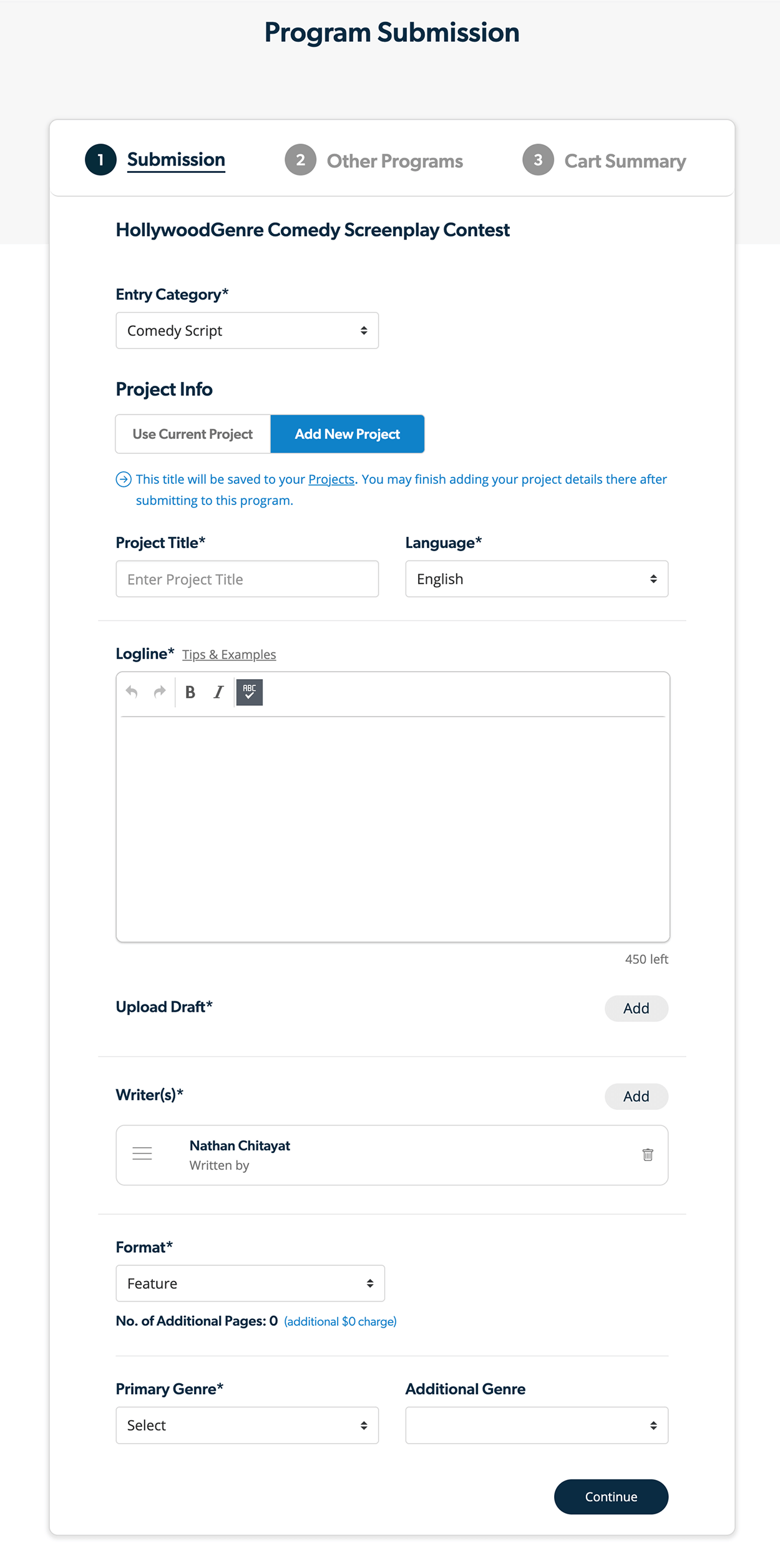
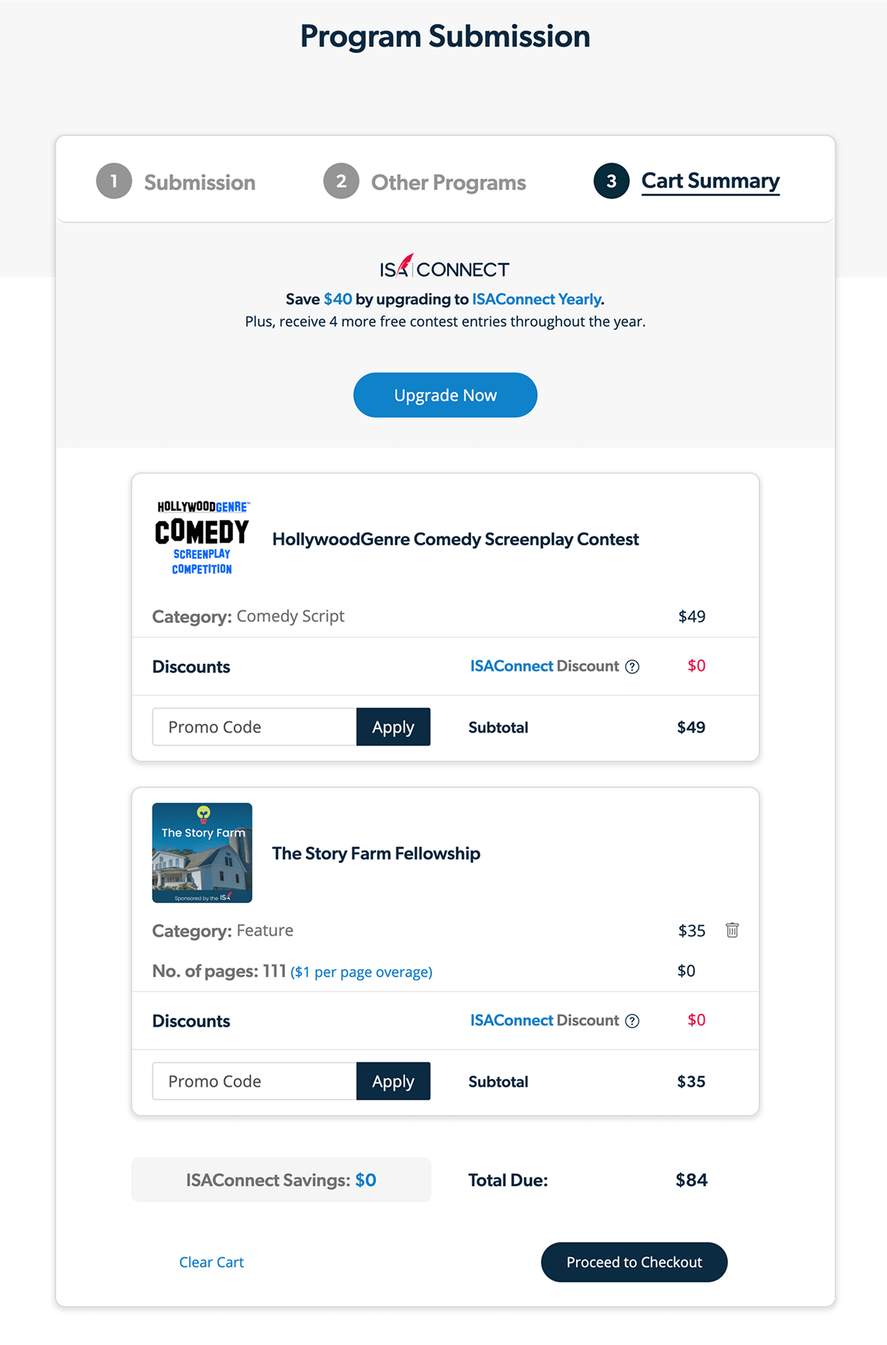
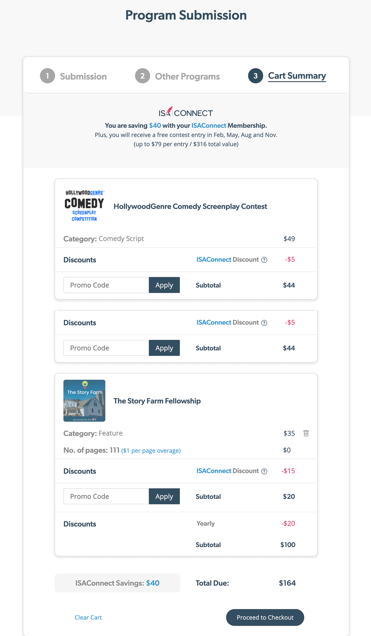
The redesigned checkout consolidated all the ways users could engage—submitting scripts, adding evaluations, and upgrading to membership—into a single, uninterrupted process. Writers could apply promo codes to individual contest entries, see real-time pricing adjustments when they joined ISAConnect, and even create new projects on the fly without leaving the flow. This approach kept every option visible while reducing drop-off from page-hopping. Even though the experience stayed dense to meet business requirements, it prioritized clarity in totals and minimized friction for first-time and returning users.
Below are screens illustrating how the checkout experience guided users through selection, upsells, and payment without breaking flow.

Users could select an existing script or create a new project on the fly without leaving checkout—a key step to reduce drop-off.

Relevant upsells—like additional contest entries or evaluations—were presented inline, keeping the flow uninterrupted.

The cart clearly itemized all selections, with individual promo code fields for each contest entry to accommodate contest-specific discounts.

Dynamic membership discounts were applied immediately after upgrading, reinforcing value without requiring the user to start over.

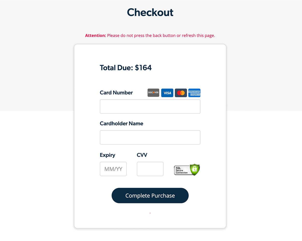
A final step focused solely on secure payment and confirmation, reducing distractions at the point of conversion.