%202.png)
%20(1).png)
SanS-
Shopify Storefront
Launched new DTC storefront — driving over $1M in first-year revenue.

Role:

Duration:

Tools:

Impact:


Problem
Sans was preparing to launch a new air purifier aimed at health-conscious millennials. The business need was clear: position Sans effectively in a crowded market, and do it on a lean budget and fast timeline.
At this stage, the user need wasn’t yet defined. We knew we’d have to uncover how potential buyers thought about air purifiers and what would motivate them to care - insights that would shape the site’s structure and messaging.
Goals
At project kickoff we framed the work around three practical, founder-approved targets:
- Open a direct-to-consumer channel — fast.
Stand up a Shopify storefront so Sans could sell and ship units from its own URL instead of relying only on Amazon and retail partners. - Launch in under 3 months with single-designer bandwidth.
Source and adapt an existing premium theme and limit code tweaks to what the founder could handle, keeping spend and hand-offs near zero. - Deliver a “trust-and-buy” experience on the first scroll.
Give health-conscious shoppers clear benefits, transparent specs, and a quick checkout path.
Research
I combined user interviews with a competitive scan to see where Sans could stand out and how shoppers weighed benefits against specs when making various purchases.
User Interviews
I interviewed five participants who aligned with Sans’s target audience: urban, health-conscious millennials with disposable income. While they varied in age, household, and living space, they shared common attitudes around wellness — and revealed a striking gap between how they defined health and what air purifiers offered.
To synthesize the findings, I organized direct quotes and paraphrased insights into an affinity map (below), revealing four core themes:
Low Product Awareness
Most participants didn’t know what air purifiers actually did. Some assumed they were only for wildfires; others thought HVAC filters were enough. One user called it “a load of BS. Sucks the dust.”
Research Builds Trust
Participants relied on reviews, Reddit threads, and friend recommendations before purchasing wellness products. Aesthetics and return policies also built confidence: “They care about their product and their brand.”
Wellness = Food and Fitness
Users equated wellness with things like vitamins, cooking habits, and exercise. Few included air quality in their health routines — which explained the lack of urgency.
Not a Priority
Even when interested, users quickly deprioritized air purifiers. They were seen as indulgent, expensive, or ugly.
%20(1).png)

Grouped quotes and observations from five interviews, synthesized into four core themes.
These findings gave us a clear picture of the user need: air purifiers weren’t part of how people thought about wellness, so our challenge was to build awareness, establish trust, and make the product feel relevant to their everyday lives.
Competitive Analysis
To understand how consumers evaluate air purifiers, I analyzed top brands featured in third-party reviews and customer rankings. I pulled the spec categories buyers referenced most often — like coverage, noise, and energy use — and mapped which brands led each one.
Price:

Coverage Area:

Noise:

Energy:
Filter Costs:
Size:

CADR:

Warranty:
Specs and top-performing brands cited most frequently in customer reviews and industry roundups. Sans didn’t lead in any category.
This confirmed that Sans didn’t lead in any measurable category. With no clear technical advantage to lean on, the strategy shifted: lead with emotional trust and lifestyle positioning, then support that narrative with specs for detail-oriented users.
Wireframes
To finalize structure before applying visual styling, I created grayscale wireframes for each of the site’s core pages: Homepage, How It Works, and Product Page. These wireframes allowed me to refine layout hierarchy, validate the scroll narrative, and annotate key UX decisions — all while working within the constraints of a third-party Shopify template.
The wireframes became a way to translate research into flow. For example, because awareness was low, we placed lifestyle benefits and “What Sans Traps” above the specs. And because trust was key, we built in visual modules for reviews and returns further down the scroll.
Heading

Annotations
1
Hero Image and Message
Shows Sans in a calm, well-designed setting to establish tone. The goal was to open with a moment of visual ease — positioning Sans as part of a considered, modern lifestyle.
2
Benefits Grid
Highlights practical outcomes like better sleep and lower energy bills. These clear, everyday advantages were chosen to build relevance early in the scroll.
3
What Sans Traps
Explains the core functionality in plain terms — what the machine actually filters out — without jumping straight to specs or science.
4
Environmental Relevance
Makes those filtered elements feel real by tying them to sources like city smog or pet dander, helping users understand why this might matter in their own lives.
How it Works Wireframe

Annotations
1
Section Intro
Here’s how it works” sets the page up as a trust-building space, not a continuation of marketing copy
2
4 Stage Breakdown
Translates technical filtration details into plain-English benefits.
3
Mid-Scroll CTA
Appears once users have context, offering a frictionless transition to the purchase decision.
4
Specs Table
Placed at the bottom for detail-oriented users — providing clarity without blocking the scroll narrative above.
Product Page Wireframe

Annotations
1
Product Hero
Price, imagery, key bullet points, and CTA are presented immediately — allowing high-intent users to act quickly.
2
Feature Stack
Each feature (e.g., portability, air quality indicator, sleep mode) is broken out into its own visual module, paired with contextual imagery. The layout is focused on function, not story.
3
Final CTA
Appears after the value stack — a clean handoff for users who scrolled through the entire set of features.
4
Specs Table
Same structure as the How It Works page — a consistent way to close the scroll for spec-focused shoppers.
Design
Research showed most people didn’t understand or prioritize air purifiers, so the design had to guide them through that gap. We structured the experience as a vertical scroll, with each page solving a distinct problem: the homepage built initial relevance through lifestyle context and benefits, “How it Works” explained the technology in plain language with modular visuals, and the product page highlighted features with a specs table available at the end for detail-oriented shoppers.
Information Architecture & Narrative Flow
The design was structured as a scrollable narrative across three screens — each serving a distinct role in the user’s decision process:
- Homepage: Built trust and desire through lifestyle imagery, emotional language, and relatable health framing.
- How It Works: Provided clear, modular validation of what Sans does and why it matters.
- Product Page: Focused entirely on features and function, supporting users who landed directly on the page or were ready to buy.
Each screen introduced just enough information to move the user forward — anchoring key CTAs at natural decision points and avoiding repetition between pages.
Shopify Constraints
Before applying full visuals, I also had to account for a core limitation: the site had to be built on a third-party Shopify template with only light customization.
This shaped both layout and content decisions. Rather than designing fully bespoke components, I worked closely with the founder to adapt native Shopify modules into layouts that supported trust, emotional resonance, and fast implementation. I prioritized structure over flourishes — sequencing modules to build emotional resonance, validate product benefits, and support purchase intent. Each layout decision balanced storytelling goals with technical feasibility, ensuring the final designs could be implemented quickly without sacrificing clarity or tone.
Feature-focused original layout

Real-world air concerns (dust, smoke, dander)
.jpg)
Adapted a native Shopify module into a custom-fit layout that supported Sans’s content and tone — without requiring full code customization.
Visual Direction
While we were working within a preset logo and typeface (Ubuntu), I made several decisions to reinforce clarity, cleanliness, and warmth:
- Typography: I selected Lato as the body font to complement the logo. It improved legibility and kept dense content areas feeling simple.
- Color Palette: I kept the palette mostly white to reflect product cleanliness, using soft gray sections to add warmth and separate content without visual clutter.
- Illustration & Icon Style: Chose a minimal, rounded icon style and light accent colors to avoid clinical associations and maintain a calm tone.
- Photo Direction: The founder and I collaborated on the shot list, balancing lifestyle realism with brand tone — aiming for clean, modern scenes that felt credible and relatable. We aimed for clean, modern domestic scenes that showed models doing everyday activities like yoga, cooking, and working from home.
These choices were all about positioning Sans as more than a gadget—something practical and attractive that fit naturally into people’s lives.
Final UI
The final screens brought everything together: scroll structure, page logic, tone, and imagery. Each screen had a defined purpose, a clear CTA, and a visual personality that aligned with how our users thought about wellness and trust.
These were the launch-ready screens prior to testing and refinements. Subsequent changes were small but meaningful — focused on tone, clarity, and polish.

Screens are scrollable.

Screens are scrollable.

Screens are scrollable.
Mobile version:


Design tradeoffs
Some tradeoffs that shaped the final experience:
- Long narrative scroll vs. Short Landing
kept the full story and added sticky “Buy” buttons for faster shoppers. - Story-first benefits vs spec-first details
Led with lifestyle - a decision shaped closely with the founder - since Sans didn't lead on any measurable spec. - Founder-mandated template vs bespoke components
Adapted Shopify modules to hit the three-month deadline, sacrificing full visual uniqueness.
Testing
With the site ready for handoff, I created a high-fidelity prototype in Proto.io to validate whether users could understand the product, navigate the content, and feel confident in the brand. Since Shopify handled the checkout flow, the focus here was on content clarity, tone, and usability — particularly for first-time buyers who might not have been seeking an air purifier in the first place.
I ran lightweight usability testing with five participants who fit Sans’s target audience — millennials across a range of incomes, family structures, and living situations. Each participant explored the prototype freely before I asked them to locate and interpret specific information: What does Sans actually remove from the air? What makes it different? How would you know if it works?
Most participants found the scroll structure intuitive and easy to follow. One summed it up simply: “It was easy. Flowed really well.”
But usability wasn’t the only goal. Because trust and tone were central to Sans’s positioning, I also ran a lightweight tone validation survey using Typeform. Seventeen participants selected five words from a balanced list of positive and negative descriptors to describe the site.
Most selected words like clean, calm, and professional — closely aligning with the brand tone we were aiming for. While the sample was small, the results reinforced our choices.
100%
Easy-to-use
Fresh
Clear
Attractive
Inviting
Boring
Dated
Dull
Cold
Busy
Confusing
Too technical
Unappealing
Visual breakdown of tone feedback. Most users saw the site as polished and trustworthy.
Iteration and Handoff
The testing results reinforced much of what we had already built — but they also surfaced a few areas where small refinements could make a meaningful difference.
typography
I swapped the body font from Lato to Avenir. While both were clean and readable, Avenir brought a rounder, more modern feel that better matched the visual tone we were aiming for.
Cleaner air and better breathing lead to a better quality sleep. Better quality sleep leads to better health, sharpness, focus and energy for living your life.
Cleaner air and better breathing lead to a better quality sleep. Better quality sleep leads to better health, sharpness, focus and energy for living your life.
Updated body typeface to Avenir for added warmth and modernity.
Headings
The original lowercase headings were used to match the style of the logo, but I had already begun questioning whether that choice undermined credibility. A few testers also described the lowercase headings as feeling “less trustworthy,” which confirmed my hesitation. I shifted to sentence case to increase perceived professionalism without losing approachability.
enjoy deeper sleep
Enjoy deeper sleep
Revised heading case to improve perceived trust and professionalism.
Color Tuning
The original accent blue (#045AA8) felt cold and clinical, and looked strikingly similar to the palettes used by several competitors. I recommended shifting to a deeper, more distinctive blue (#132B73) that gave the interface more visual weight and better supported Sans’s emotional tone.
Updated primary color to improve differentiation and align with emotional tone.
Logo Variant
The small “breathe” tagline in the original logo often became illegible at smaller scales — and even at full size, it sometimes confused the brand name. I recommended simplifying the mark to clarify the identity. The client opted to keep the original, but my version was included in final files for potential future use.

Recommended going with the simplest of the existing logo variants to improve brand clarity as well as legibility at smaller scales.
Finally, I also restructured the wordiest section of the product details page to improve flow and scannability — especially for users who were skimming.
These changes were documented and shared with the client at handoff. While not all were implemented immediately, the updated versions — including refined typography, revised headings, and adjusted copy — were incorporated into my own final designs.
Final Designs with Refinements Applied
Reflects updated typography, color palette, heading styles, layout flow, and simplified copy. Changes were based on design judgment and validated through lightweight user testing.

Screens are scrollable.

Screens are scrollable.

Screens are scrollable.
And the mobile versions...


Outcomes
- Sold $1 M of air purifiers in the first 12 months.
— Sans Co-founder
Lessons
- Fixed scope forces focus.
Constraints like Shopify templates and a three-month kept attention on the narrative, visuals, and flow that matter at launch. - Find a way to differentiate yourself, and lead with it.
When specs don’t set you apart, benefits, imagery, and tone must carry the weight of trust. - Lightweight testing pays off.
Five usability sessions and a 17-response tone survey drove same-day tweaks that sharpened credibility.
.svg)
AI Today
When I designed Sans, mood exploration was manual and time-consuming. With AI , I can generate divergent brand directions in minutes. These boards aren’t production assets, they’re quick explorations that help stakeholders react to contrasts early, before we commit to structure.
Cozy comfort
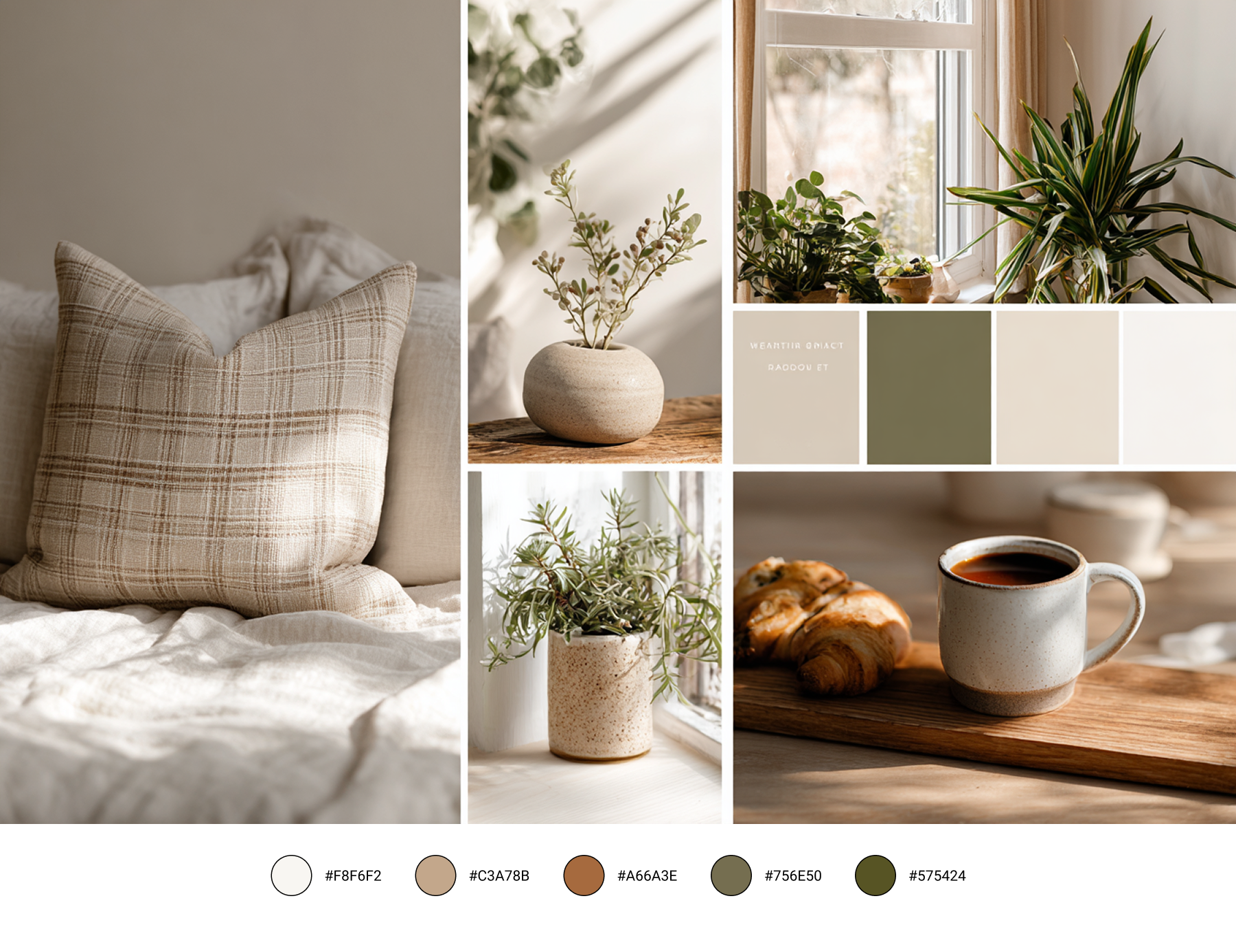
"Inhale comfort."
Sleek Tech · includes #045AA8
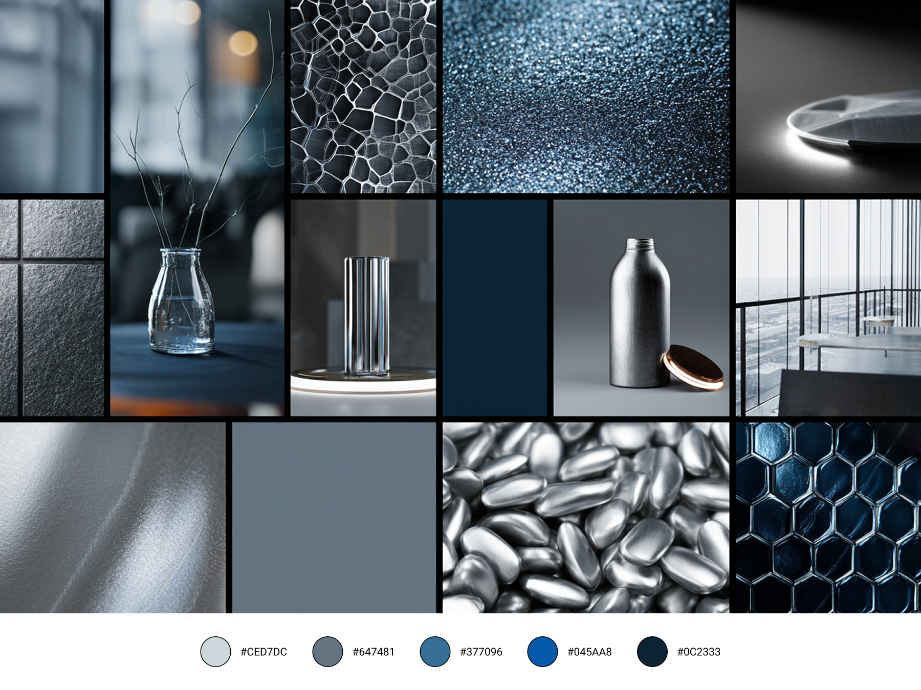
"Breathe innovation."
Luxury minimal
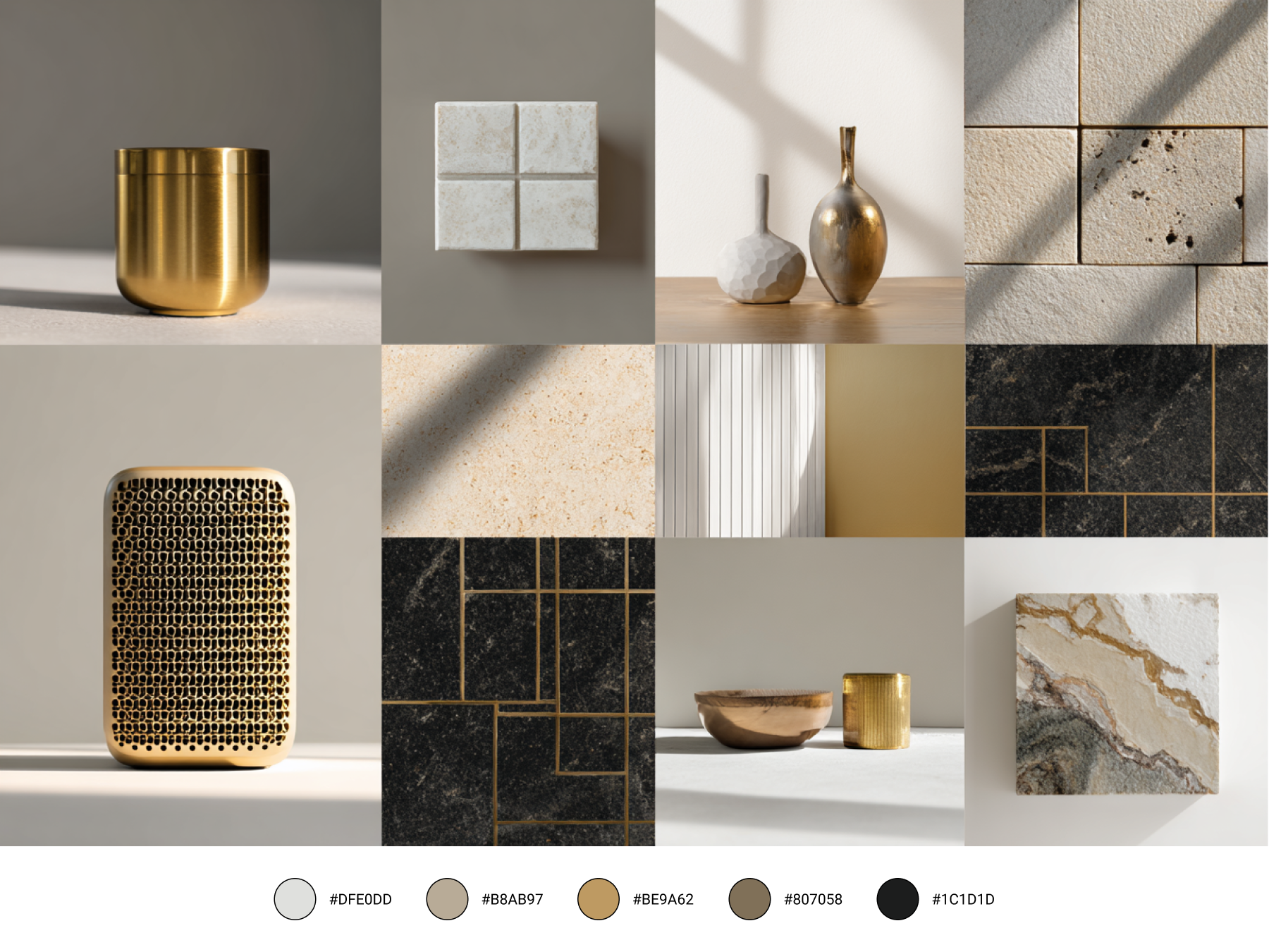
"Elevate your air quality."
I also used Figma AI to quickly iterate on taglines for each board, reducing copy exploration considerably.