
.png)
CASE STUDY
Capital One Supplier Risk Dashboard
At Capital One, I was the sole product designer on a three-month project focused on improving clarity and efficiency within the company’s internal supplier management platform — a tool used to manage supplier activities, contracts, and risk across the enterprise.
The platform had already unified data from multiple legacy systems, but many users still didn’t know where to start or how to use the platform efficiently, limiting adoption and impact.
My goal was to help the team solve two core problems: (1) lack of clarity in the platform’s entry experience, so users knew what mattered when they landed, and
(2) inefficiencies in critical workflows, especially around risk oversight and contract approvals.
Through targeted research and design exploration, we arrived at a new dashboard that surfaced the most important metrics and risks upfront — improving how users prioritized their time and decisions. By the end of the pilot and initial rollout, the platform saw a 41% increase in regular users, far exceeding expectations and laying the groundwork for future role-specific improvements.
Project Summary

Tools
Figma

Duration
3 months

Role
Sole Product Designer

Team
Product Owner
Program Manager
Engineers

Constraints
Performance limitations
Legacy backend

Responsibilities
Research
UX design
Data visualization
Design handoff
NOTE
Visuals are simplified recreations designed to respect NDA boundaries while accurately reflecting design decisions and outcomes.
Problem
Capital One’s supplier management platform was designed to solve a major visibility issue: teams across the enterprise — from third-party managers to internal operations — had been relying on a patchwork of disconnected tools to track supplier data.
Even after launch, many users still chose to jump between systems to track contracts, risk, and supplier status. It wasn’t just slow—it made it easy to miss something important or make the wrong call.
The new platform successfully consolidated these tools into a central hub. But usage data and internal feedback revealed it still wasn’t delivering the expected value.
Two user patterns stood out:
Didn't see the value
Some users didn’t believe the platform reduced effort — so they stuck with old habits, like pulling reports manually or checking systems individually.
Didn't know where to start
Others arrived but felt disoriented. The landing page displayed only pinned suppliers and pending activities — with no guidance on what mattered or how to extract meaningful value.
To address the latter group we started by assessing the limitations of the platform’s existing entry experience.
.png)
Original landing page showing Pinned Suppliers and pending Activities, requiring prior system knowledge to navigate effectively.
In exploring how we might address that group's needs, we surfaced a broader opportunity: a redesigned landing view could support both groups, not just by orienting them — but by actually making the system faster, clearer, and more actionable.
That pivot shifted the focus from clarity alone to efficiency and prioritization. A dashboard could offer a clear starting point for disoriented users and tangible time savings for users who didn't see the benefit of using the platform — surfacing what mattered most, right away.
Done well, that kind of entry experience could exceed the platform’s original goal: not just improving visibility, but helping users spot issues faster, reduce manual effort, and make smarter supplier decisions at scale.
To guide that redesign, we focused on the supplier management department — the platform’s core user group. We chose to start with Accountable Executives (AEs), who sat in the middle of the hierarchy: senior enough to need a macro view, but close enough to day-to-day issues to feel the friction firsthand. A dashboard built for them could scale both upward and downward — informing leaders while supporting the people handling approvals and supplier comms.
Research
I conducted nine 1:1 interviews with Accountable Executives (AEs) in the supplier management group to understand:
- What kinds of data they relied on most
- Where friction or blind spots slowed them down
- What improvements would make their daily workflows faster and more reliable
To synthesize what we heard, I created an affinity map to identify major patterns across participants. I grouped the themes into three clusters—gaps in visibility, fragmented data, and manual workarounds—all pointing to the same broader problem.
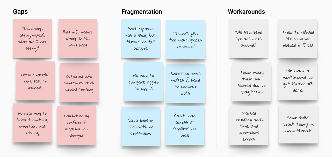

Grouped interview insights into three categories: gaps, fragmentation, and workarounds, each showing how risk was amplified across the workflow.
While those clusters captured the shape of the problem, risk — whether general or tied to specific metrics — dominated across all of them. It came up far more often than any other theme.
Risk
Efficiency
Improvements
Workflow
Clarity
Other
Nothing else came close. Risk was the dominant theme.
"What fires do I need to put out?"
That anxiety around risk shaped how AEs approached nearly every aspect of their work — from where they looked for answers to how they made decisions. The following insights illustrate how that pressure showed up in practice:
Gaps in Visibility
With supplier data spread across tools, users worried something important might fall through the cracks.
Fragmented Data
It was hard to spot trends or systemic issues when each supplier and metric lived in a separate tool, view, or workflow.
Manual Workarounds
Some tracked data manually using spreadsheets or email threads — adding friction and undermining confidence in the data itself.
AEs consistently prioritized eight key risk metrics for assessing individual suppliers, with four of those metrics also providing critical portfolio-wide insight. While Portfolio Health and Supplier Risk drove the core design focus, Contract Approvals emerged as a distinct “quick win” — not because of supplier performance, but because approval delays, often buried in emails, created downstream risk and were relatively easy to surface with the right dashboard hooks.
Because risk showed up across every theme — not just in metrics, but in the stress of the workflows themselves — we knew the dashboard had to surface that risk clearly and make it actionable. That meant prioritizing visibility at both the portfolio and individual levels, so users could catch issues early, act with confidence, and reduce the chance of things slipping through.
These findings shaped the dashboard’s structure from the start — turning risk clarity, not just data access, into the foundation of the design.
Goal
The dashboard needed to surface risk clearly, support confident action, and reduce the time users spent hunting through systems. We structured the layout around three key areas from our research: Portfolio Health, Supplier Risk, and Contract Approvals. These directly reflected what AEs cared about most — making it easier to prioritize, act quickly, and avoid missed issues.
Design
1. Wireframe Progression
To evaluate layout directions, I started with a card-style layout based on early stakeholder ideas and internal Capital One components. The format was easy to read but didn’t scale for the volume and density our users needed. I moved toward a table format to support faster scanning, comparison, and interaction across large datasets.
.png)
Card-style layout based on early stakeholder direction. Built using Capital One’s internal components. Clear at small scale, but hard to scan and inefficient at volume.
.png)
Early table structure. Better for comparison and navigation, but lacked cues and controls for prioritization.
2. Layout Overview
I structured the dashboard around this dense “megatable” layout that displayed supplier-level metrics in a single, scrollable view. Each row showed key risk signals, interaction hooks, and priority flags for a given supplier, allowing users to assess, compare, and act without navigating between pages. This layout supported high-volume scanning and became the foundation for all subsequent interaction and design decisions.
.png)
Combined key risk signals, supplier-specific data, and action triggers into a single, high-density interface — enabling faster triage, comparison, and confident next steps without switching views.
3. Summary Graphs
To support pattern recognition at scale, I added four graphs above the table showing portfolio-wide risk trends using the four key metrics identified in the interviews. These gave users a quick read on system health and made it easier to spot concerning shifts without manually inspecting rows.
.png)
High-level visuals made it easier to scan for system-wide red flags — before diving into individual suppliers.
4. Before and After
The original interface showed only pinned suppliers and pending tasks — offering limited guidance on what to do first and no easy way to dive deeper. The new layout surfaced key risk signals and supplier priorities upfront, combining macro trends and individual supplier data in a single, scannable view. This saved time, reduced the risk of missing something important, and helped prevent human error.

Only showed pinned suppliers and pending tasks, offering little direction and no way to see broader risk patterns.

Surfaces key risk signals and supplier priorities in a single table view, enabling faster triage and deeper insights without switching pages.
5. Interaction Elements
Because a dense table can quickly feel overwhelming, I added a few small touches to keep things clear and actionable. These details made it easier for users to stay oriented and work faster.
.png)
Key Interaction Enhancements
1
Supplier Count Confirmation
Displayed the total number of monitored suppliers so users could immediately tell if any were missing.
2
Approvals Shortcut
Before, users had no easy way to see how many approvals were pending and had to go to another system to act. I added a persistent button with a counter, so they could jump straight to the right spot with one click.
3
More Details Icons
Clicking an icon next to any summary graph opened a modal showing the suppliers behind that trend — connecting macro risk patterns to the specific vendors driving them.
4
Filters and Sorts
With hundreds of rows to sift through, users needed more control over what they were seeing. I added flexible filters and sortable columns so they could focus on what mattered most — without needing to export the data.
5
Escalated High-Risk Indicators
“There’s just so much data. If something’s really wrong, I need to see it fast.”
Because users were scanning quickly and juggling other tasks, we reserved red exclusively for critical risk. This visual priority helped the most urgent issues stand out, reducing the chance something serious would be missed.
.png)
Example modal opened from a summary graph, surfacing portfolio-level ratings for a specific risk metric.

Example modal opened from the megatable, showing supplier-specific risk details and linked case information.
6. Key Tradeoffs
Several decisions shaped the final layout:
- Scorecards vs. Table
Scorecards were more readable but didn’t scale. The table handled comparison better in a high-volume setting. - Modals vs. Separate Pages
Modals preserved context. I added deep links in the modals when even more detail was needed, navigating to existing pages in the platform in a new tab. - Red Cell Alerts vs. Multi-Color Graphs
Colors were used to signify risk levels in the graphs, but I removed those so red table cells could stand out clearly as risk signals.
Without this structure, users would’ve had to export the data and piece together risk signals manually — slowing them down and increasing the risk of human error.
Testing and Pilot
Since we didn’t have time for formal usability testing, we treated the pilot as our real-world test bed. It let us see how people actually used the dashboard day-to-day.
After securing signoff from SMEs that the design met functional and compliance requirements, we launched to 30 pilot users across key teams.
After two weeks, we sent out a quick survey:
- Was anything unnecessary?
- Was anything missing?
- Was anything confusing?
We also opened a dedicated Slack channel for informal feedback. This helped capture nuance — including edge cases, real usage stories, and unexpected needs across roles.
All responses were added to a shared tracker, then reviewed with the product and engineering teams for feasibility and prioritization.

Excerpt from the pilot feedback tracker showing a sample of accepted, deferred, and future design suggestions.
Most feedback reinforced that the dashboard offered real value — but I still made three key refinements based on the user reactions.
Each fix was relatively lightweight but made the experience more resilient at scale — and validated that even informal, real-world testing could surface the changes that mattered.
Download Icons
Added export options to portfolio graphs so users could include them in decks without taking screenshots.
Secondary and Tertiary Sort
Introduced secondary and tertiary default sort logic to keep high-priority suppliers consistently near the top.
Clarifying Tooltips
“I had to ask what a few of these columns meant. Not all of us use the same terms.”
Added hover definitions for risk terms unfamiliar to adjacent roles outside the core AE group.
Results
In the first month after launch, regular usage increased by 41% — a clear sign that the new model delivered value and encouraged behavioral change.
Pilot users described the experience as transformative:
“Being able to see all of this in one view is amazing.”
“I am SO HAPPY WE ARE here.”
Feedback showed the dashboard didn’t just help Accountable Executives—other teams started using it too, confirming that the design could scale more broadly.
Reflections
This project taught me how to balance user clarity with business complexity. Capital One’s platform wasn’t polished or clean behind the scenes, but the goal was to make it feel simple anyway.
I learned how to push for clarity in complex systems, support user agency even when workflows were rigid, and advocate for small UX wins that added up to big improvements.


.svg)


